COMPANY
COMPANY
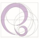
The symbol mark of proprebebe integrates the letters "p" and "b" from "proprebebe" to represent the embrace between a mother and her baby, as well as the peaceful sleeping position of a baby in the womb. This design embodies the warmth, care, and nurturing essence central to our brand’s identity and mission.
The design ensures that the identity of 'proprebebe' is easily recognizable, while the rounded fonts enhance the soft image associated with baby products
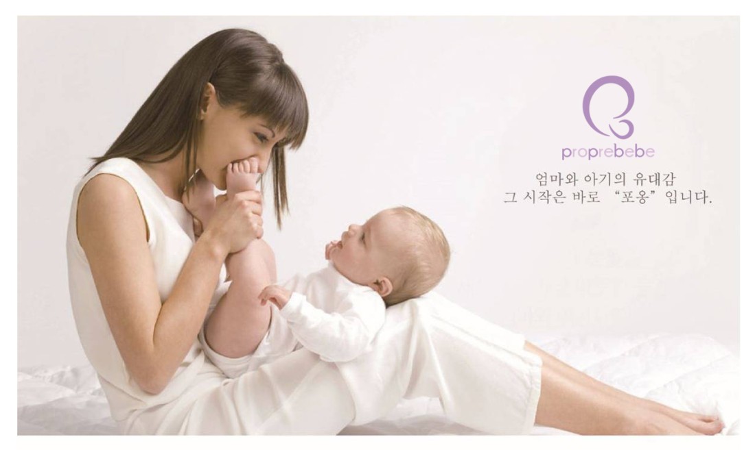
㈜포프베베는 ‘청결한 아기'라는 뜻의 불어로 영유아 세정 전문 브랜드 입니다.
‘다기능 아기비데’ 를 시작으로 유아 세정에 필요한 제품들을 지속적으로 연구, 개발하여 유아 세정 전문 브랜드로 나아갈 것입니다. 또한 “우리의 제품으로 더 나은 세상을 만들자“ 라는 당사의 슬로건과 같이 너무도 소중한 아기와 육아로 힘들어하는 부모님들을 위해,독창적이고 믿을 수 있는 안전한 제품을 만들어 나가겠습니다.
포프베베의 로고 제작의도
proprebebe의 p와 b를 이용하여 엄마와 아기가 포옹하는 모습, 자궁속에서 잠자고 있는 모습을 형상화 하여 심볼 마크를 제작하였습니다.
누구나 쉽게 proprebebe의 아이덴티티를 확인할 수 있게 하였고 각 폰트에 라운드를 주어 유아 용품의 부드러운 이미지를 극대화 시켰습니다.